Remember our blog about CMYK vs RGB? Well today, we’re going even deeper. We’ll be discussing the Pantone Colour System. If you’ve ever struggled to maintain consistent colours across your designs, then you may want to carry on reading.
What is the Pantone Colour System?
Pantone was established in the 1950s by Lawrence Herbert and began as a provider of colour cards, mainly for cosmetics. However, its big moment came in 1963 with the development of the Pantone Matching System (PMS).
Pantone created a standardised colour system that completely changed the game in multiple industries. This was like a universal language for colour communication. Each colour was assigned a unique ID, ensuring consistent colour results across global manufacturing processes. Its categorisation meant that designers could make precise colour selections with the assurance they would be consistent throughout digital and print design.
Pantone Colour of the Year
Since 1999, The Pantone Colour Institute has been trend forecasting the colour of the year. Experts analyse global trends, cultural influences and emotional impacts over the past 12 months and apply this to the upcoming year. This year, PANTONE 13-1023 Peach Fuzz has been chosen and is said to evoke a “feeling of kindness and tenderness, communicating a message of caring and sharing, community and collaboration”.

Why Colour Consistency Matters
Consistency in colour is like the glue that holds your brand together and makes the logo on your website match the one in your brochure. It’s the colour that customers should instantly associate with you, but keeping it consistent isn’t always a walk in the park.
Ensuring consistent colours across various platforms and print is tricky. Your logo might appear vibrant and true on print materials but not on social media, or vice versa. This can confuse customers, or just not look as good!
How Pantone Bridges the Gap
Pantone is the ultimate mediator between print and digital design. While CMYK is commonly used in print media and RGB in digital design, Pantone colours serve as a unifying language that ensures consistency across both.
At its core, the Pantone Matching System serves as a library of standardised colours. Their system assigns a unique ID to each colour for easy reference. This system allows designers and printers to speak the same colour language, No more colour discrepancies, and a seamless transition from screen to paper. This is Pantone’s magic touch.

Applications of Pantone in Design
Your brand’s colours are more than just a visual element, they reflect your identity. From Coca-Cola Red to Starbucks Green, Pantone helps brands choose a colour that stands out on the shelves and makes an impact across websites and social media.
Real-world applications of Pantone are used across various industries. For instance, automotive companies use Pantone colours to ensure the perfect paint finish across vehicle models. Fashion designers will use Pantone for fabric dyes and textile printing.
Pantone Tools & Resources
For designers, colour is a powerful tool. Pantone offers both physical and digital tools to ensure consistent colour across all formats. By utilising them, you can be sure your designs are accurate and impactful.
Pantone Connect: Pantone Connect is a digital tool that integrates with your design software, giving you instant access to the entire Pantone library right on your screen. These tools are perfect for helping you pick and match colours accurately.
Using Pantone on platforms like Adobe Photoshop and Illustrator is straightforward. You can easily add these colours to your designs, ensuring consistency from your screen to the final product. Although some special features might require a subscription, these tools will save you time and hassle in the long run.
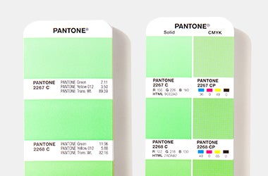
Pantone Colour Guide: Pantone Colour Guides are indispensable. Picture this: a marketing team wants their promotional materials to match their brand’s unique colour perfectly. By using a Pantone guide, they can easily point to the exact shade they need. This means the printer knows exactly what colour to use, eliminating any guesswork.

Getting colour consistency right is crucial for any designer, marketer or brand manager for accurate visuals and the Pantone Colour System is the ultimate solution. By offering a universal colour language and reliable tools like the Pantone Colour Guide and Pantone Connect, it ensures that you maintain colour consistency across all digital and physical assets. If you are interested in learning more about colour, check out our CMYK vs RGB blog to gain a better understanding of these different colour modes.


